Most brand guidelines are written in RGB and quietly fall apart at the press. A designer's guide to CMYK translation, bleed requirements, and the questions to ask before anything gets printed.
Last week a client's marketing team dropped a conference banner into Slack with a same-day deadline: 500 × 1500, needed in Asia by morning.
Nobody in the channel knew whether the banner was for print or digital. Nobody knew the bleed requirements — the printer hadn't sent specs. Those two questions took me ninety seconds to ask and answer, and they were worth more than the design time: a digital banner needs no bleed at all, and a print banner without it comes back from the printer with a hairline of naked white on every edge, in front of an audience, in another hemisphere, unfixable.
The file went out at trim-plus-bleed with a note for the printer: no crop marks, so trim to 500mm × 1500mm. The banner printed clean. But the moment stuck with me, because it's the same moment I keep having: an entire generation of brand work now gets designed by people who have never sent anything to a press — and the first time their brand touches paper, it dies a little. Here's why, and how to keep it alive.
Your brand guidelines were almost certainly written in RGB — hex codes, chosen on a screen, approved on a screen. Screens produce color with light, and light is generous: those electric teals, hot corals, and saturated oranges that make a palette feel alive live in a part of the color space that ink physically cannot reach.
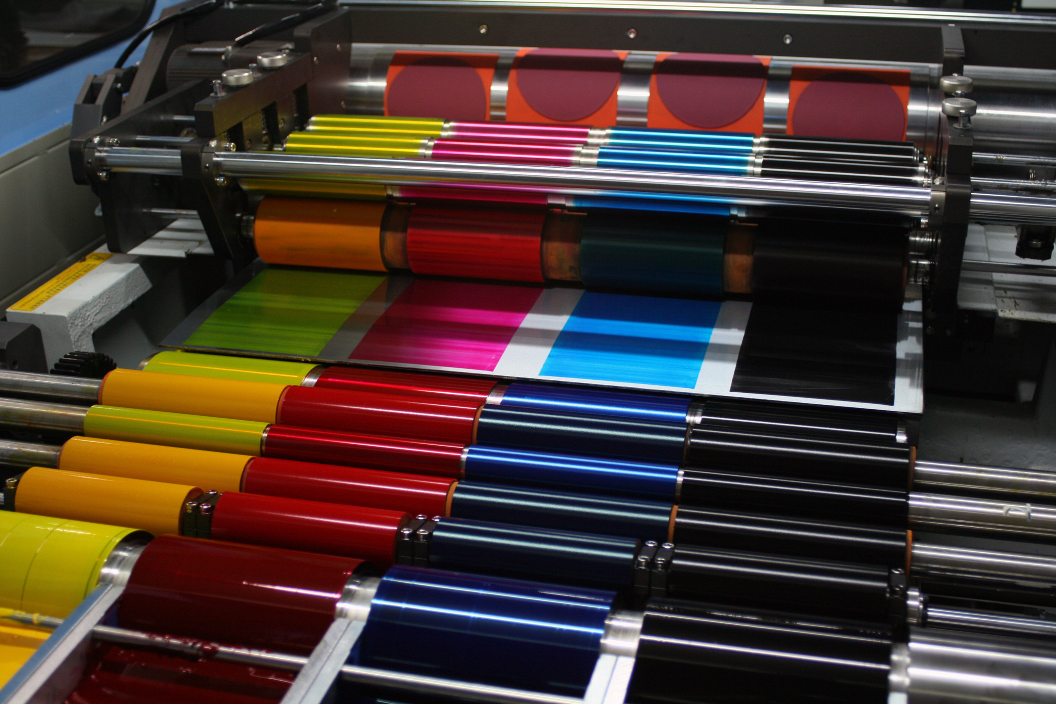
CMYK produces color by subtracting light from paper. Its gamut is smaller, and it's smallest exactly where modern brand palettes love to live — the vivid blues, the neon-adjacent brights. Auto-convert a vibrant RGB palette and you don't get your brand, you get your brand's tired cousin: duller, muddier, and slightly embarrassed.
This is not a printer error. No press setting fixes it. The colors you approved never existed in ink.
When I extended Denova Collaborative Health's rebrand into a fifteen-piece print system — trifolds, rack cards, trade-show banners, in English and Spanish — the brand guidelines were, as usual, written in RGB. The palette was the brand's biggest asset: bright, warm, the reason people picked the brochure up. Running it through a menu-command conversion would have handed the client a printed system that approximately resembled their website. Approximately is how brands erode.
So the palette got translated, color by color: CMYK builds specified by hand and judged against the brand's intent — is this still the same bright? does it still feel warm next to its neighbors? — not against a Delta-E readout. Sometimes the honest translation isn't the mathematically nearest color; it's the ink build that produces the same feeling the screen version does. That's a design judgment, which is why it can't be automated and why it belongs in the guidelines themselves.
The deliverable that actually protects a brand: a palette page with both values — hex for screens, CMYK builds for press — decided once, by a designer, in advance. If your brand book only has hex codes, it's half a brand book, and the missing half is the half that gets printed ten thousand times.
Three terms carry most of print's failure modes:
If the printer hasn't provided specs, 1/8" bleed all round is the safe default — and say what you did in the delivery note ("trim size X, 1/8" bleed included, no crop marks"). Printers are collaborators, not mind readers; the note is the handshake.
Print work also breaks when a layout designed for one physical context gets scaled into another. The Denova system spanned a brochure read at arm's length in a waiting room, 4×9" rack cards grabbed in seconds from a stand, and 33×81" pull-up banners read from across a trade-show floor. Same brand, same palette — but a banner is typography at sightline distance, and a rack card is a headline competing in a slot machine of other rack cards. "Make the flyer bigger" is not a banner. It's a flyer with delusions.
The Spanish edition taught the adjacent lesson: translation changes the physics. Spanish runs roughly 25% longer than English, so the consumer brochure wasn't just translated — it was reformatted to its final 12×9" trim so the language had room to breathe instead of being squeezed into English-shaped boxes. If your brand serves a bilingual audience, the layout has to be bilingual too, not just the words.
Before anything goes to press: Print or digital? Trim size confirmed in real units? Printer specs in hand — or 1/8" bleed defaulted and declared? Everything edge-touching runs into the bleed; everything that matters sits in the safe zone? Colors specified as CMYK builds from the brand's translation table — not auto-converted on export? Fonts embedded or outlined? Delivery note tells the printer the trim, the bleed, and whether there are crop marks?
Ninety seconds. That's what it costs. What it buys is a printed piece that matches the brand instead of approximating it — and a client who learns, from one Slack exchange, that you're the person in the room who knows how the physical world works.
Screens forgive everything. Paper forgives nothing. A brand that's only ever been tested on the forgiving surface isn't finished yet.
---
Alyssa Ostroff is a brand designer and strategist in Fort Lauderdale who has sent an unreasonable number of things to presses on four continents. The full Denova print system is written up here.
I'm Alyssa Ostroff — designer and brand strategist. Open to senior design and creative lead roles at mission-driven teams, and taking two freelance projects this quarter.