Design
Branding

Denova Collaborative Health

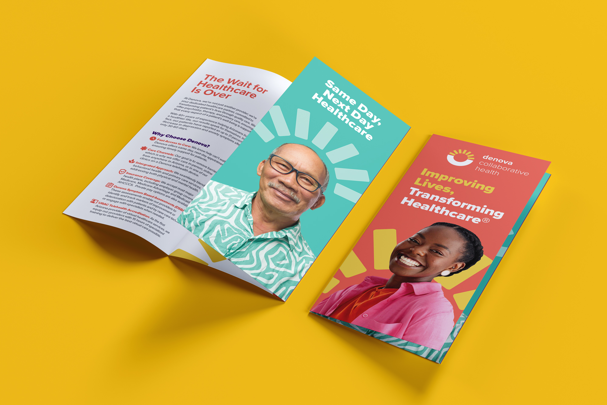
Open Denova trifold brochures on yellow, their teal and orange panels carrying patient portraits.
Client
Denova Collaborative Health
Year
2024–2025
My role
Freelance Brand & Print Designer
Sector
Healthcare · Behavioral health
Services
Print and editorial design, bilingual collateral system, environmental graphics, editable template build
One brochure refresh grew into a fifteen-piece bilingual system their team can now update themselves.

The brief

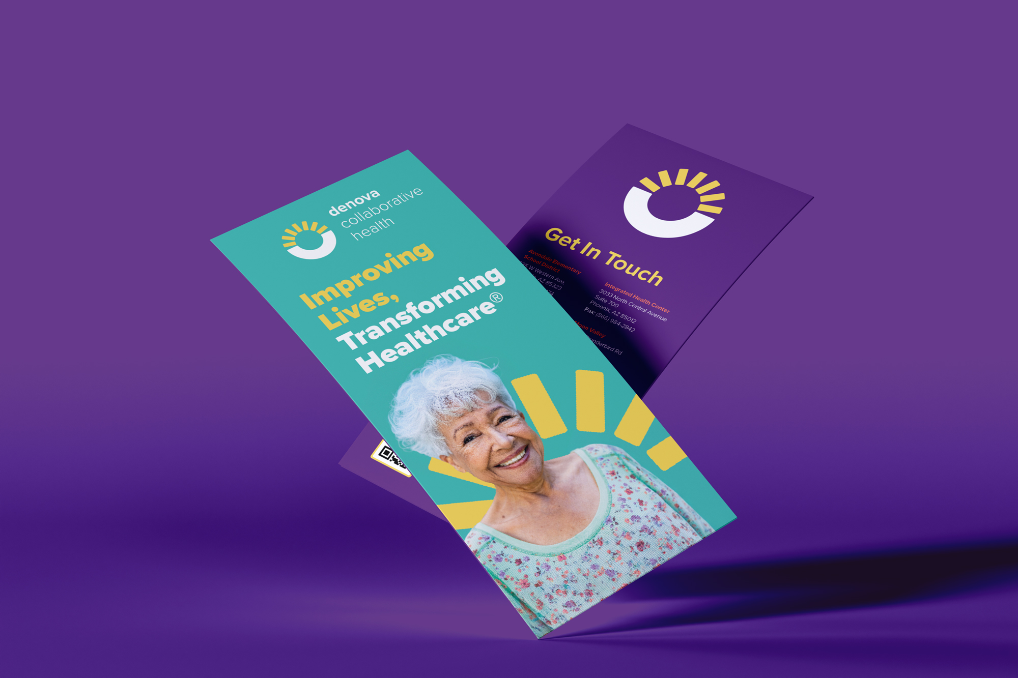
Denova is a Phoenix-area healthcare organization that has been treating Arizona patients for forty years and had rebranded about a year before I came in. Their business development trifold hadn’t caught up. The brief was narrow: refresh one brochure using the new brand guidelines, keep the brightness that made people pick it up, and fix the horizontal type that everyone’s eyes skated past.

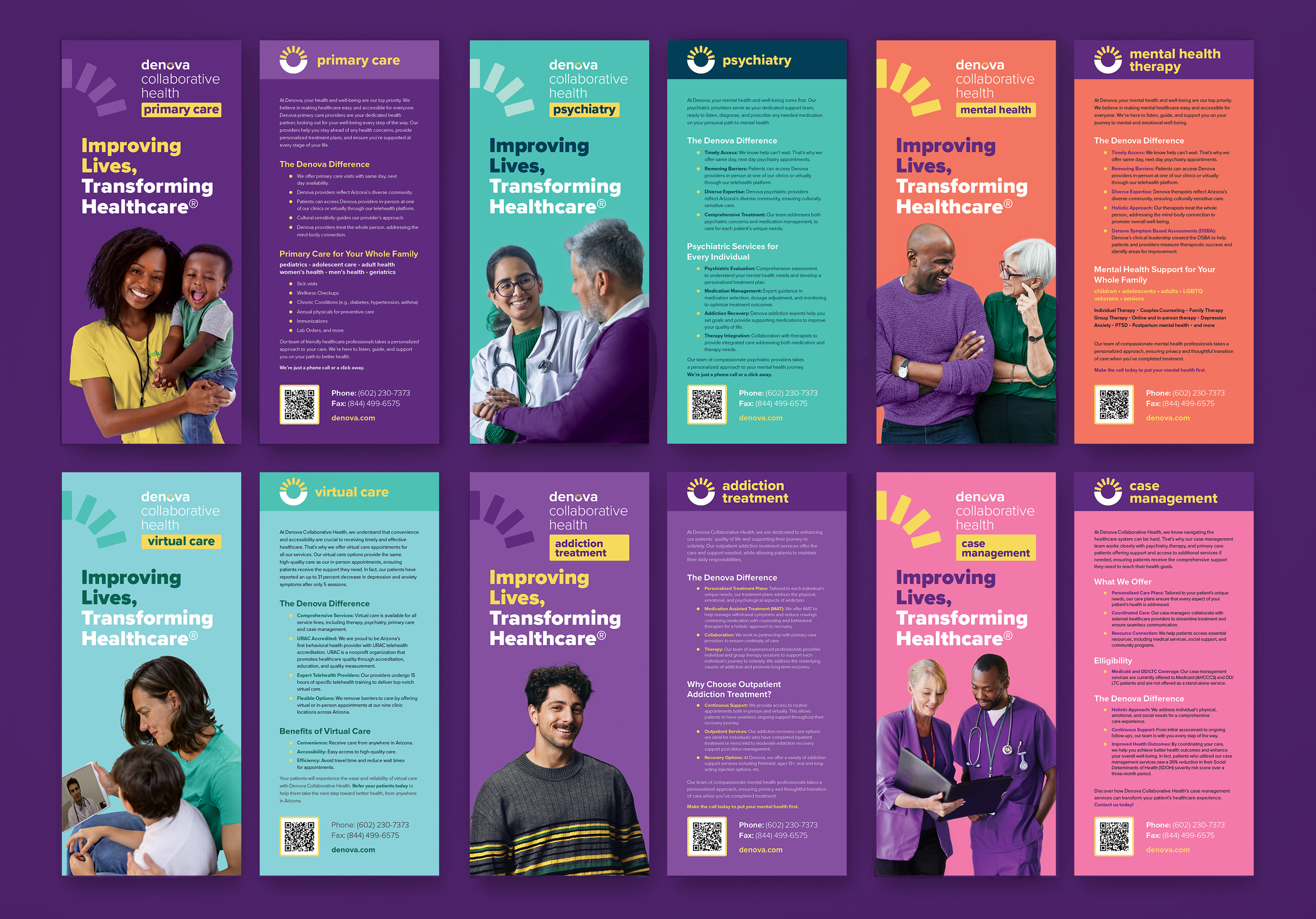
It didn’t stay one brochure. Over the next four months it became a collateral system covering every service Denova offers — addiction treatment, case management, mental health therapy, primary care, psychiatry and virtual care — in English and Spanish, in print and on stands.
Why it was hard

  • One organization, six service lines, and audiences that barely overlap. A person looking for addiction treatment and a person looking for a pediatrician are not reading the same piece, but they have to be looking at the same brand.
  • Denova serves pediatrics through geriatrics, and the imagery had to actually reflect that — every age, and the ethnic makeup of Arizona. Finding representative stock at that specificity is a real constraint, not a nice-to-have.
  • The information volume fought the format. A trifold has six panels and a service description that has to be complete enough to be useful and short enough that nobody puts it down.
  • Print reality. Brand guidelines written in RGB don’t survive contact with a CMYK press — the palette had to be translated so the printed piece looked like the brand rather than a duller cousin of it.
  • Two of the pieces — mental health therapy and psychiatry — are adjacent enough that patients confuse them. The design had to make the distinction obvious at a glance, on a 4×9 card.

What I did

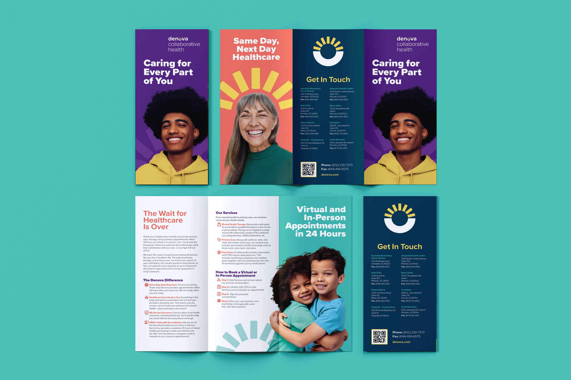
  1. Rebuilt the trifold around a reading order. Deep color blocks for headlines, dark type on white for the detail, scaled hierarchy so a reader knows what to look at first. The panel that had been overwhelming became scannable.
  2. Pulled the palette back to the brand — in CMYK. Every color specified for press, so the printed piece matches the website instead of approximating it.
  3. Built one system, then differentiated within it. Consumer, psychiatry/behavioral health, and psychiatry/behavioral health/primary care trifolds share a structure but carry different front-panel color, so each audience gets a piece that is visibly theirs.
  4. Extended it to six rack cards. 4×9 double-sided cards for each service line, same system, with mental health therapy and psychiatry deliberately separated in name and treatment.
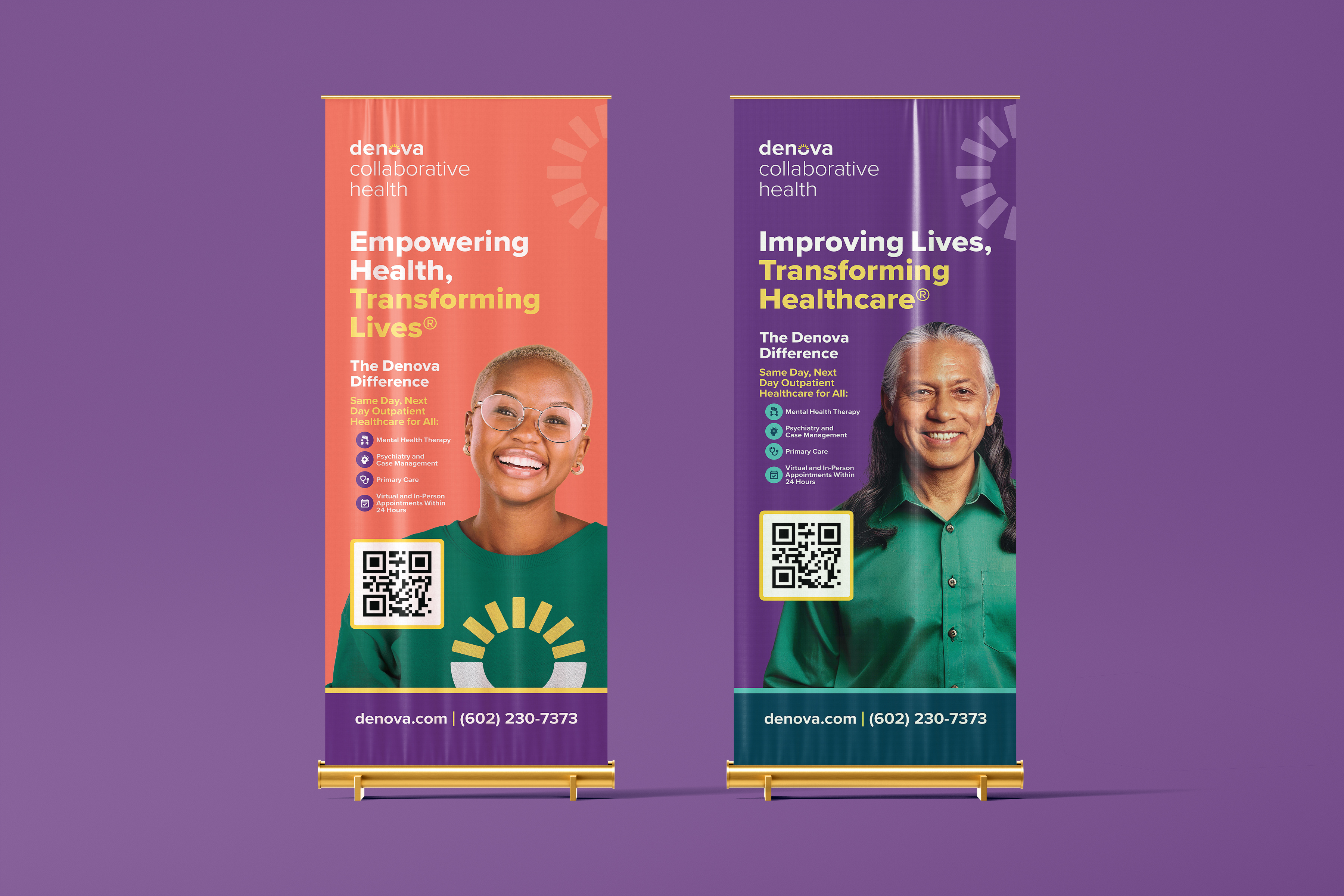
  5. Took it into the room. Two 33×81″ pull-up banners for the business development team — cohesive with the print, not identical to it, built for a trade-show sightline rather than a hand.
  6. Designed the letterhead the CEO’s partnership letters sit on. Two one-page letters, to referral providers and to non-profit partners — deliberately quieter than the rest of the system, white ground and a signature treatment, so they read as correspondence rather than marketing.
  7. Produced the Spanish edition. The full consumer trifold in Spanish, reformatted to the final 12×9 trim.
  8. Handed over the source. Packaged InDesign files at every milestone, so nothing was locked to me.
  9. Rebuilt it as editable templates. Eighteen months on, when their team needed to update addresses and copy themselves, I rebuilt the brochures as PowerPoint templates — Google Slides wouldn’t embed Proxima Nova, so PPTX was the format that kept the brand intact and put editing in their hands.

What changed

  • A brief for one brochure refresh became roughly fifteen finished pieces across six service lines, in two languages and three formats.
  • Everything went to print and into the field — brochures, rack cards, and banners the business development team takes to events.
  • Denova’s marketing team can now update their own collateral without a designer, and without the brand degrading when they do.
  • The client came back eighteen months later to extend the system rather than start over.
You’ve done a great job bringing our brand to life in these brochures.
Jessica Goble, Marketing Manager, Denova Collaborative Health
Selected visuals
No items found.

Got something complicated?

That's the fun kind. Open to senior designer roles, and taking two freelance projects this quarter.

Related projects

Let's make something clearer than it was.

I'm Alyssa Ostroff — designer and brand strategist. Open to senior design and creative lead roles at mission-driven teams, and taking two freelance projects this quarter.
© 2026 The Nine Five Four, LLC, dba Alyssa Creative. Powered by caffeine. Lots and lots of caffeine.
Built accessibly, obviously.