Branding
Design

Rio's Place

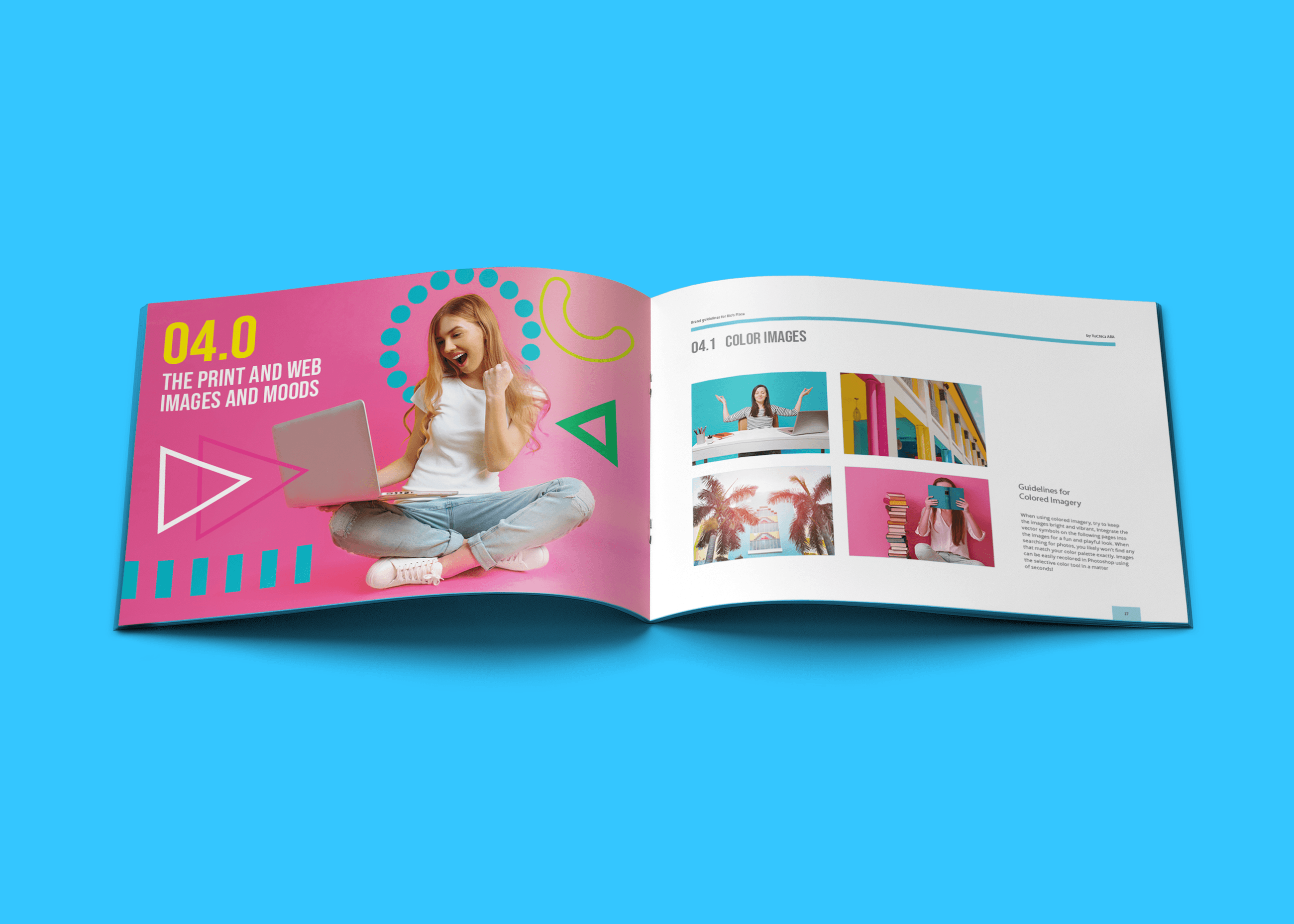
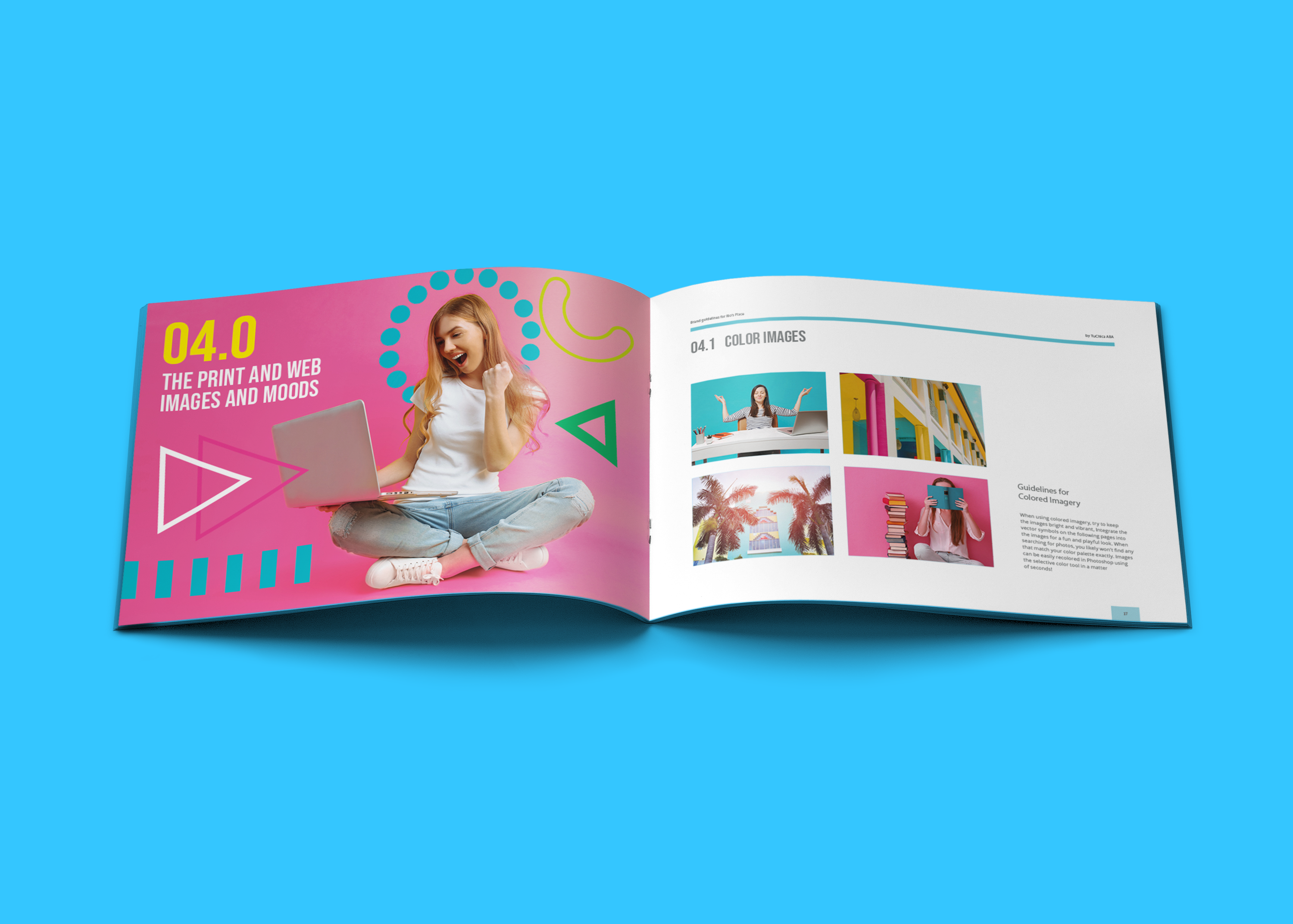
The Rio's Place brand guidelines lying open to a section spread, in the brand's pink and cyan.
Client
Rio's Place
Year
2020
My role
Freelance Graphic Designer, subcontracted through LBMG Marketing
Sector
Healthcare · ABA and mentoring services · Founder-led
Services
Brand identity, logo design, brand guide, bilingual brand system, Canva template library, stationery, print collateral
Two services, two audiences and an existing brand resolved into one identity — bilingual, and built in two weeks.

The brief

Monica Castro — Tu Chica — was running two things under separate banners: applied behavior analysis services for children and adults across South Florida, and mentoring for people working toward ABA certification. She wanted them under one roof, named Rio's Place after her daughter, with Rio's Place being the physical location of the practice.

The job was to resolve all of it into a single identity: fold the equity she'd already built in Tu Chica into a new parent brand, serve two very different audiences with one visual language, and work in Spanish and English at once. Designed, built and handed over in about two weeks.

Why it was hard

  • Two audiences, not two products. Families choosing ABA care for a child and professionals pursuing ABA certification want completely different things from the same brand. One identity had to earn trust with a parent and credibility with a practitioner.
  • The brand is named after a child. That raises the stakes past the usual — a mark that misses isn't just off-brief, it misrepresents something personal.
  • An existing brand had to survive the merge. Tu Chica already meant something to Monica's audience. The new parent identity had to carry that forward rather than erase it.
  • Bilingual can't be a translation step. Miami audiences move between Spanish and English mid-sentence, so the system had to work in both without either looking like the afterthought version.
  • Warmth and clinical credibility pull apart here. Bold Miami color makes the brand human and unintimidating; too much and a parent evaluating a care provider stops taking it seriously.
  • No marketing team on the other side. Everything I handed over had to be usable by the founder herself, indefinitely, without a designer.

What I did

  1. Designed the identity and the logo. A mark for a company that didn't visually exist yet, resolving two service lines and an existing brand into one name.
  2. Set the palette on Miami, deliberately. Old-school Miami Vice — vibrant, warm, unmistakably local — so the brand felt like the city its clients actually live in rather than generic clinical blue.
  3. Wrote the brand guide. The rules of the system documented, so the identity could hold its shape after handover.
  4. Built an element library. A kit of graphic pieces Monica could drop into her own imagery to make anything she made read as Rio's Place.
  5. Designed bilingually. English and Spanish treated as equals in the collateral — including a flyer that runs one language per side rather than crowding both onto one.
  6. Templated it in Canva. Social posts and presentation deck pages built in the tool the founder actually uses, so the brand kept running without me.
  7. Designed the stationery. Business cards and letterhead — the pieces that make a new company look established in a first meeting.

What changed

  • Two separately branded services became one company with a single identity, with the existing Tu Chica brand folded in rather than discarded.
  • Monica left with a brand guide, an element library and Canva templates — able to produce her own materials indefinitely, not just a logo and a bill.
  • Spanish-speaking families encountered the brand in their own language by design, not as a translated afterthought.
  • The whole system was delivered in roughly two weeks.
Selected visuals
No items found.

Got something complicated?

That's the fun kind. Open to senior designer roles, and taking two freelance projects this quarter.

Related projects

Let's make something clearer than it was.

I'm Alyssa Ostroff — designer and brand strategist. Open to senior design and creative lead roles at mission-driven teams, and taking two freelance projects this quarter.
© 2026 The Nine Five Four, LLC, dba Alyssa Creative. Powered by caffeine. Lots and lots of caffeine.
Built accessibly, obviously.