Development
Branding

Bariatric Essentials

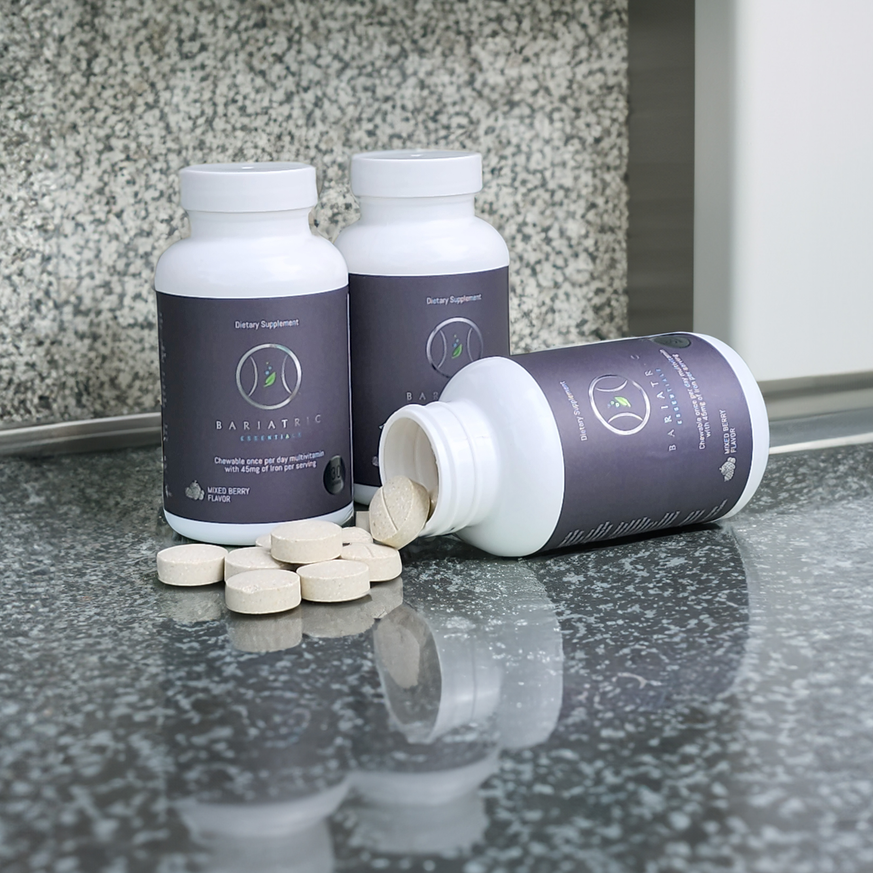
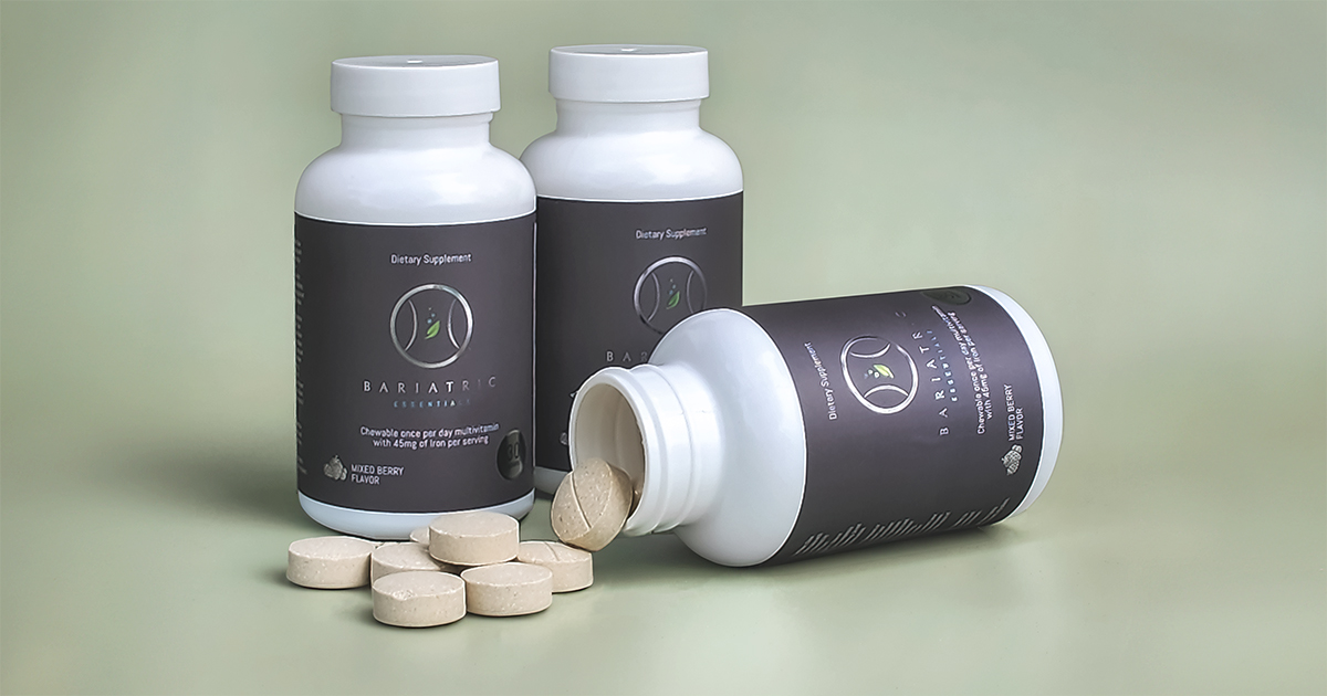
Two Bariatric Essentials bottles standing and one on its side with chewable tablets, photographed on sage green.
Client
Bariatric Essentials
Year
2023–2024
My role
Freelance Brand, Web & E-commerce Designer — and product photographer
Sector
Healthcare · Bariatric nutrition · E-commerce
Services
E-commerce website design and development, product photography, art direction, marketing collateral, product information design
I built the customer-facing experience around a bariatric nutrition product — from the photographs on the bottle to the website where patients bought it.

The brief

Bariatric Essentials makes nutritional products specifically for people who have undergone bariatric surgery, including a once-daily chewable multivitamin designed around their post-surgical needs.

The product existed. What it needed was the ecosystem around it. My work spanned the places where a patient encounters and evaluates that product: the e-commerce website, product photography, marketing materials and detailed product information.

That made this less of a website project and more of a product-brand project. The same bottle needed to feel credible on a specification sheet, appealing on an e-commerce page and consistent in marketing — while communicating information patients actually need to make decisions about their health. I designed and developed that experience from the product outward.
Why it was hard

  • This wasn't an ordinary consumer product. A bariatric multivitamin lives at the intersection of healthcare and e-commerce. It has to earn trust like a health product while still doing the basic job of retail: helping someone understand it and want to buy it.
  • The audience has specific nutritional needs. Bariatric patients aren't browsing a generic vitamin aisle. Product information, dosage and formulation matter, and the design couldn't bury those details beneath marketing.
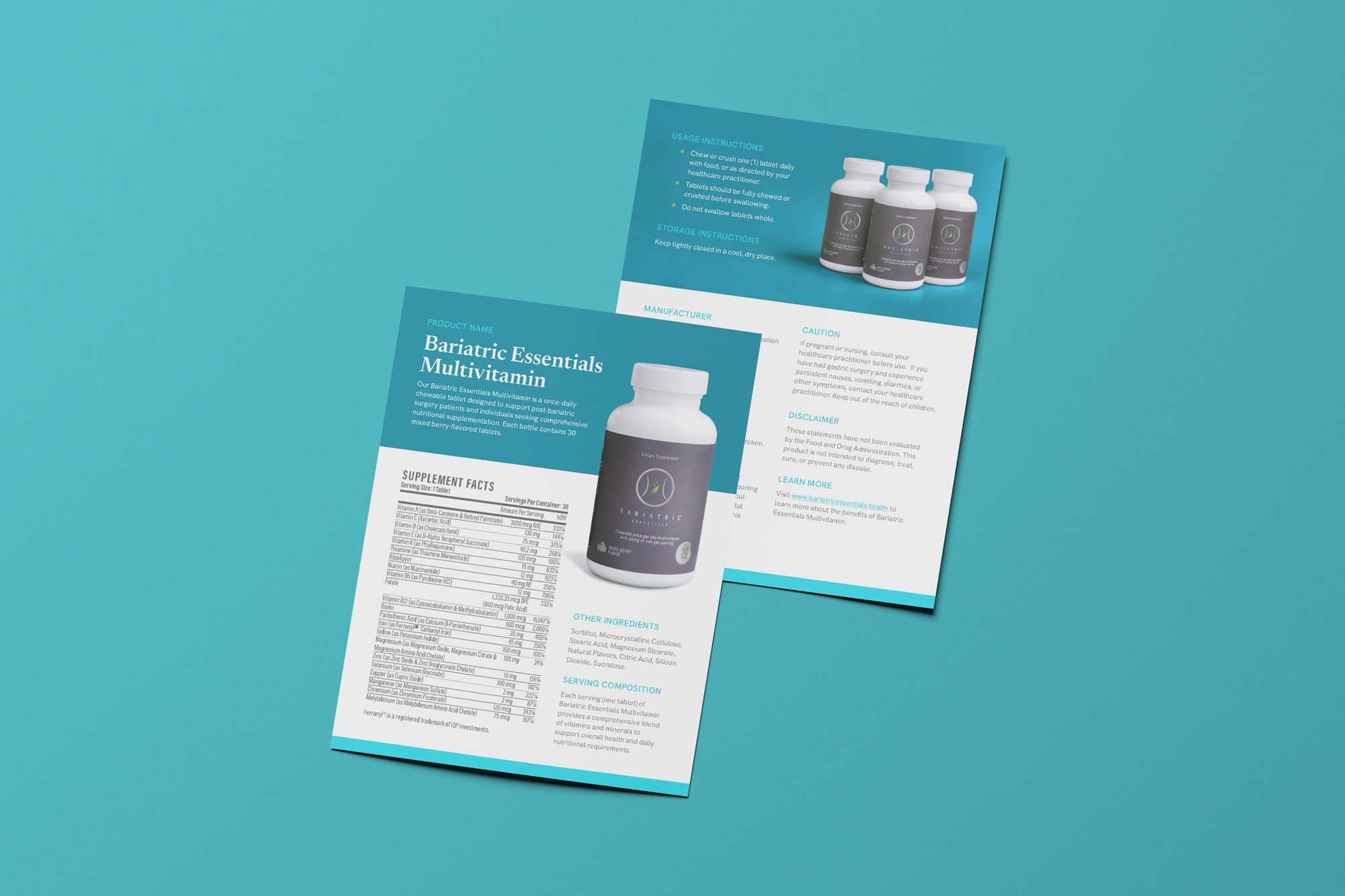
  • The information hierarchy carried real weight. Ingredients, nutrition information, directions, cautions, storage requirements and manufacturer information all competed for limited space. The job was to make dense information usable rather than simply fit it onto the page.
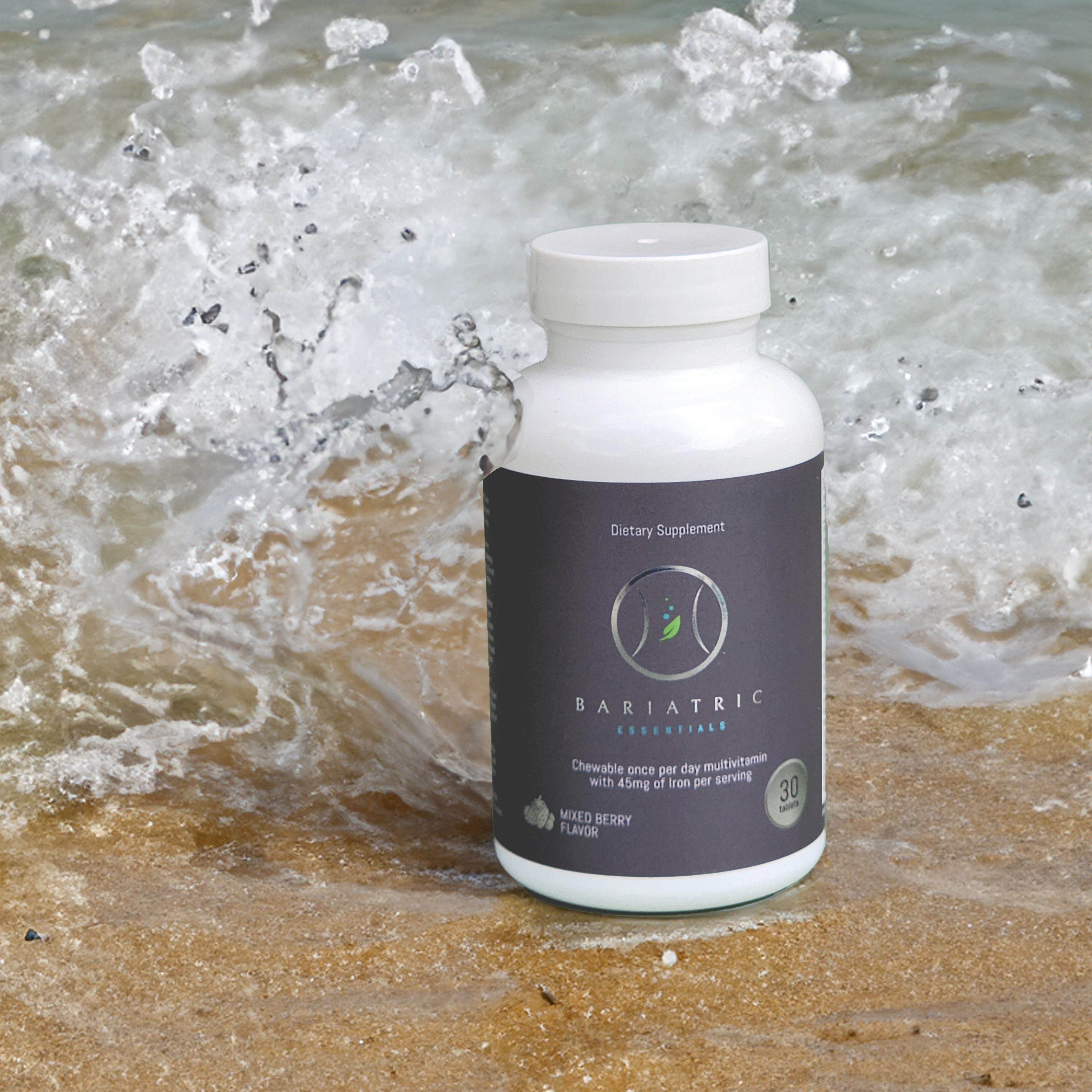
  • There wasn't a ready-made visual library. The product needed imagery that felt consistent with the brand and polished enough to carry an e-commerce experience, which meant creating the photography rather than designing around whatever happened to exist.
  • Clinical and commercial had to coexist. Too clinical and the brand feels cold. Too lifestyle-driven and a specialized nutritional product can lose credibility. The visual system needed to sit comfortably between the two.
  • Every touchpoint had to agree. Photography, web, product information and marketing couldn't each interpret the brand differently. A customer moving between them needed to feel like they were interacting with one product and one company.

What I did

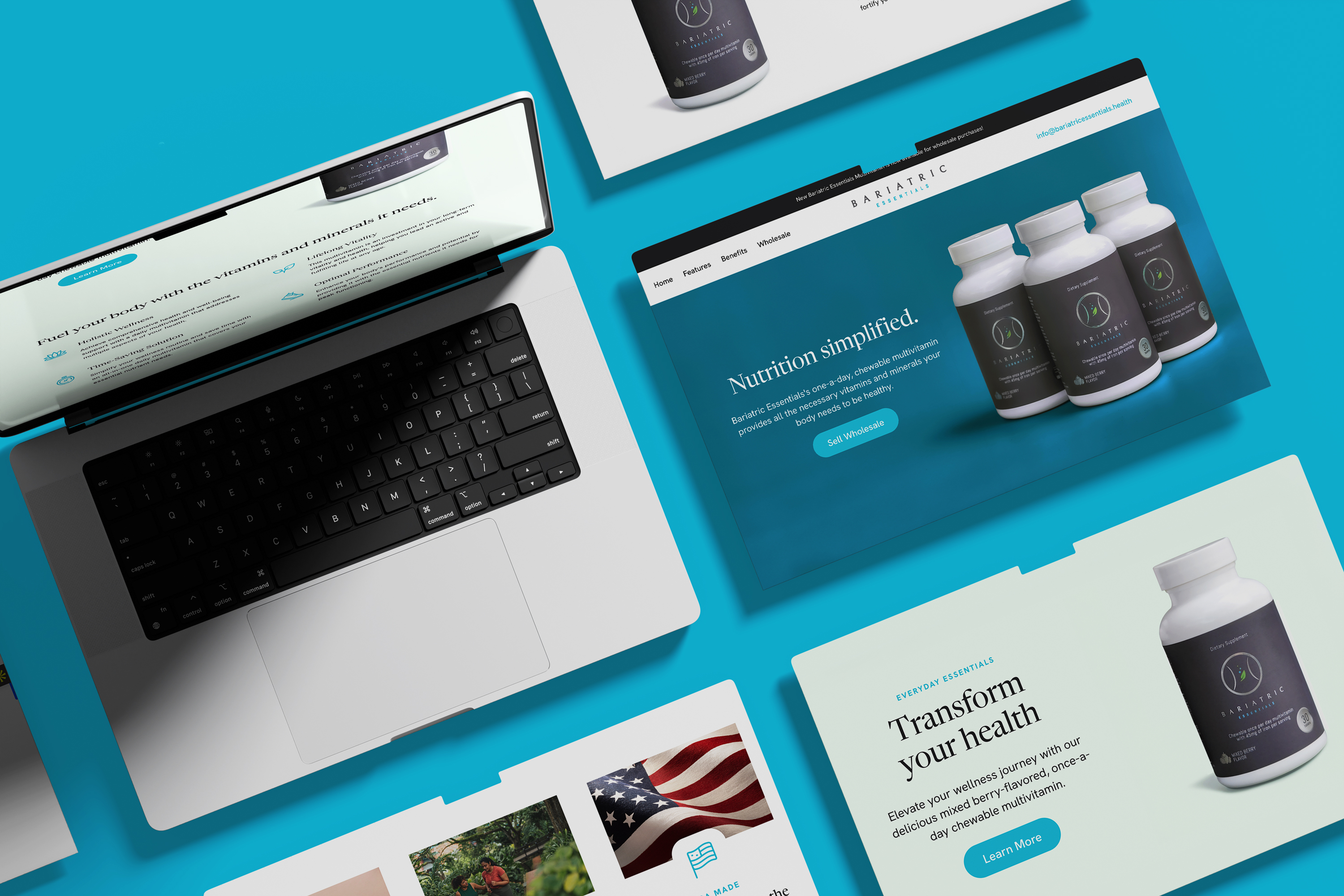
  1. Designed and developed the e-commerce experience. Built the online storefront around the questions a patient needs answered before purchasing — what the product is, who it's for, how it's used and why it's different — rather than treating the website as a digital product shelf.
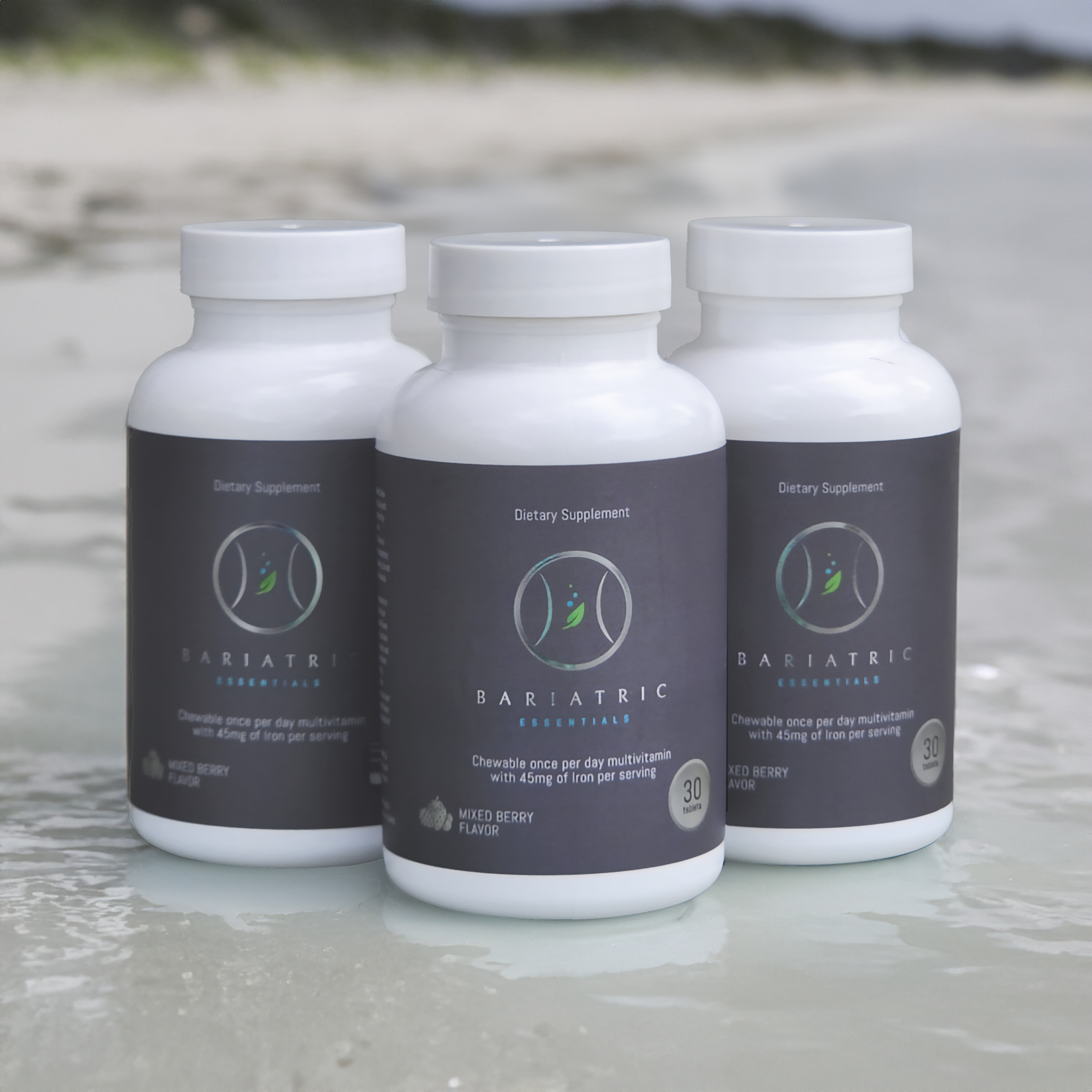
  2. Created the product photography. Planned and executed a full product shoot, building a consistent image library that could work across product pages, marketing and collateral instead of relying on mismatched or purely functional imagery.
  3. Art directed the product as a brand. Composition, backgrounds, lighting and image treatment were considered as part of the larger visual identity, so the photography didn't sit separately from the design around it.
  4. Turned technical information into usable information. Designed detailed product collateral covering usage instructions, nutritional and ingredient information, cautions, storage and manufacturer details — without letting required content overwhelm the hierarchy.
  5. Designed for healthcare credibility without defaulting to clinical. The visual language stayed clean and structured where trust mattered, while photography, spacing and presentation gave the product enough warmth to function as a consumer brand.
  6. Connected education to conversion. Rather than separating product education from e-commerce, I used hierarchy and visual storytelling to answer common purchase questions inside the shopping experience, shortening the distance between understanding the product and buying it.
  7. Built consistency across physical and digital touchpoints. The same visual decisions carried through the website, photography and supporting collateral, giving Bariatric Essentials a recognizable customer-facing system rather than a collection of unrelated assets.

What changed

  • Bariatric Essentials gained a complete e-commerce presence built specifically around its product and patient audience.
  • The company moved from simply having a physical product to having a cohesive customer-facing brand experience around it.
  • A dedicated product shoot created a reusable image library for e-commerce and marketing.
  • Dense nutritional, usage and regulatory information became structured collateral that patients and healthcare audiences could navigate more easily.
  • The website, product photography and supporting materials shared one visual language, strengthening consistency wherever a customer encountered the product.
  • The project gave Bariatric Essentials an infrastructure that could support both product education and direct-to-consumer sales.
Selected visuals
No items found.

Got something complicated?

That's the fun kind. Open to senior designer roles, and taking two freelance projects this quarter.

Related projects

Let's make something clearer than it was.

I'm Alyssa Ostroff — designer and brand strategist. Open to senior design and creative lead roles at mission-driven teams, and taking two freelance projects this quarter.

© 2026 The Nine Five Four, LLC, dba Alyssa Creative. Powered by caffeine. Lots and lots of caffeine.
Built accessibly, obviously.